Collect reference material for an illustration to fit one of the categories below:
- Making a cup of tea
- Getting to my house
- Playing a tune on an instrument
Explore the information to impart and the steps involved. Decide on what the main points are and how many stages are involved. Work at a large scale and work out the space needed for each step. Be mindful of hierarchy and the dynamics required to draw the viewer’s eye from one stage to the other.
Decide on the tools and materials you will use for this illustration. If you use colour, be aware of how it adds focus and can help your communication process. Check that the finished piece works both as an attractive illustration and its primary function – to give instructions.
Paging through pictures of the three categories above, I have decided on ‘Making a cup of tea’ for this exercise. I am curious to know how you make the perfect cup of tea. Are there some fail-safe rules to follow? I came across this delightful article on Jamie Oliver’s blog written by Becky Sheeran. Becky is a tea connoisseur with over 300 teas to choose from for her favourite cup of tea. At the end of the day, she concludes there is one perfect way to make it – “you should enjoy it just the way you like it.” (Sheeran, 2021)
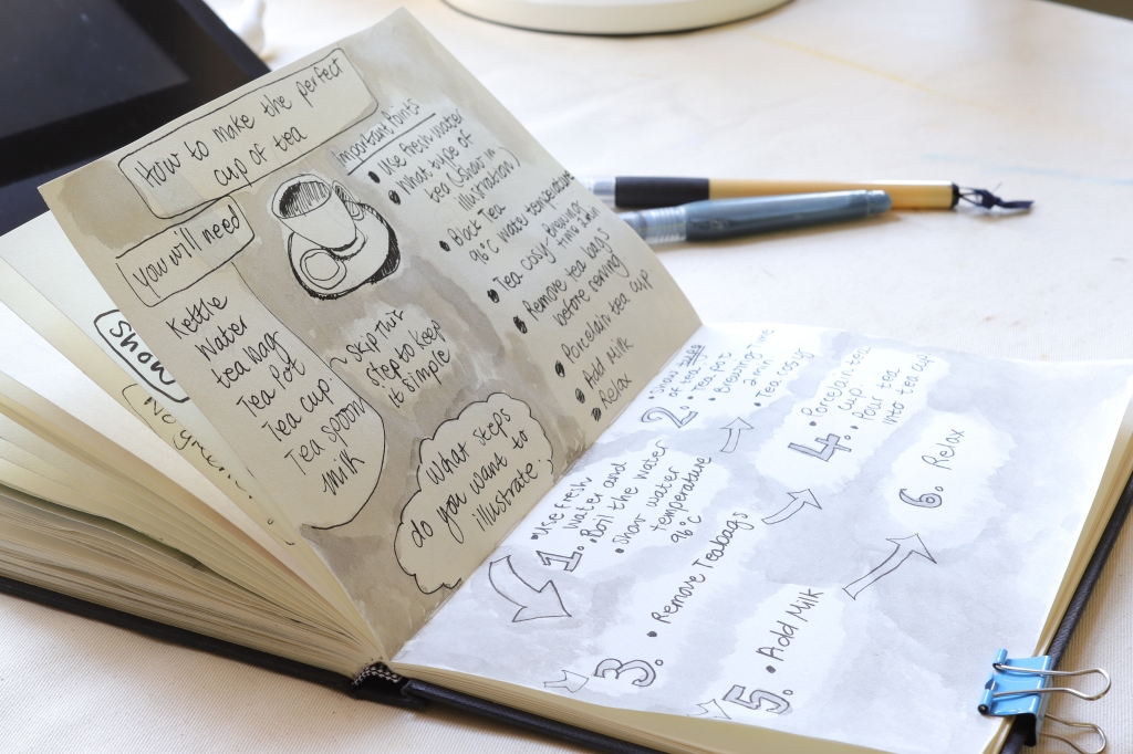
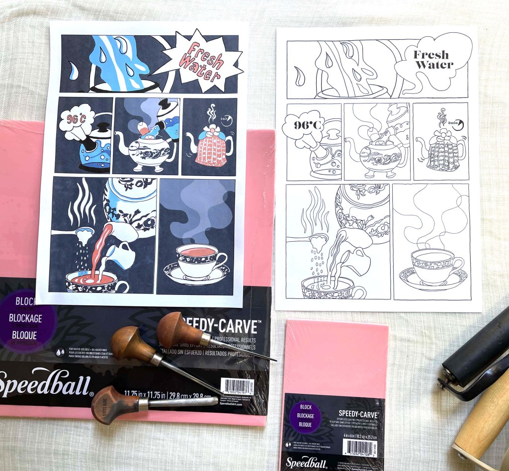
Following Becky’s advice and my personal preference, I have brainstormed six essential steps to make tea.
- Use fresh water. Tea needs oxygen. Re-boil water removes the oxygen and will leave your tea tasting a bit metallic.
- Get the right water temperature. Most black teas need around 96°C
- All about porcelain. Add tea bags and boiling water to your porcelain teapot. Ceramic is porous, so it will make your tea cool down too quickly.
- The importance of brewing time and a tea cosy. Put your tea cosy over the pot to keep the water close to the optimum temperature, and brew your tea for at least 2 minutes.
- Add milk and sugar. Pour the tea, milk and sugar into a porcelain teacup.
- Relax. Take a moment out of your day to enjoy a cup of tea.
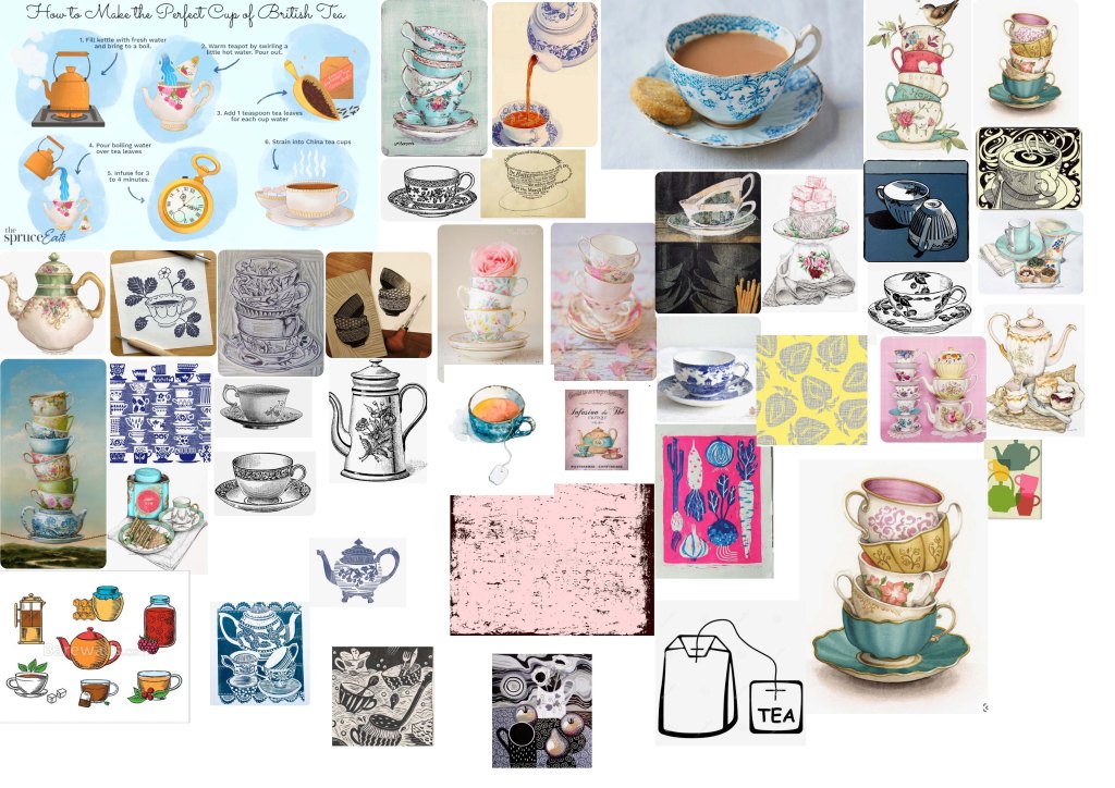
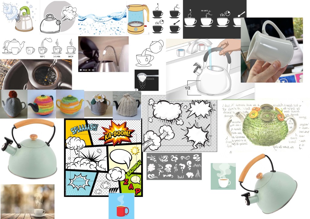
Next, I explored by collecting references of pictures and taking my own photos.
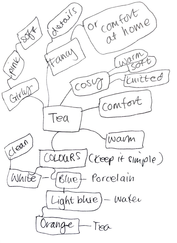
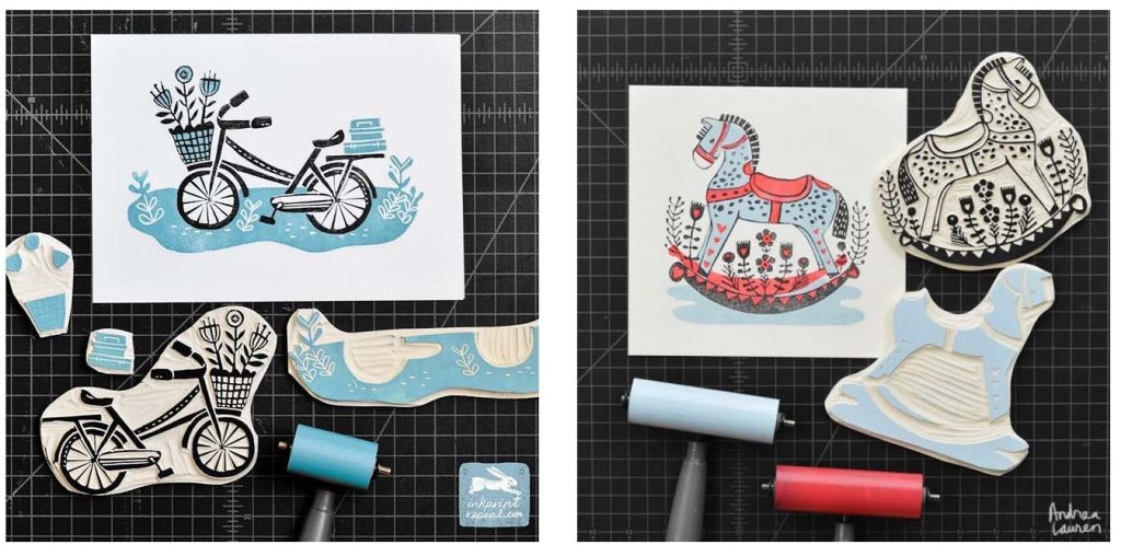
I then went to my sketchbook to put ideas together and started exploring colours. I was inspired to do this illustration in lino print, so I have tried to keep it simple and only use lines most necessary. One of my favourite lino print artists is Andrea Lauren. I love the clean lines and colours of her linocuts. I researched her techniques and creative process and was pleased to learn that she has online classes to share her techniques and workflow. Her website is https://www.inkprintrepeat.com/work I have done both her online classes and purchased the material needed.
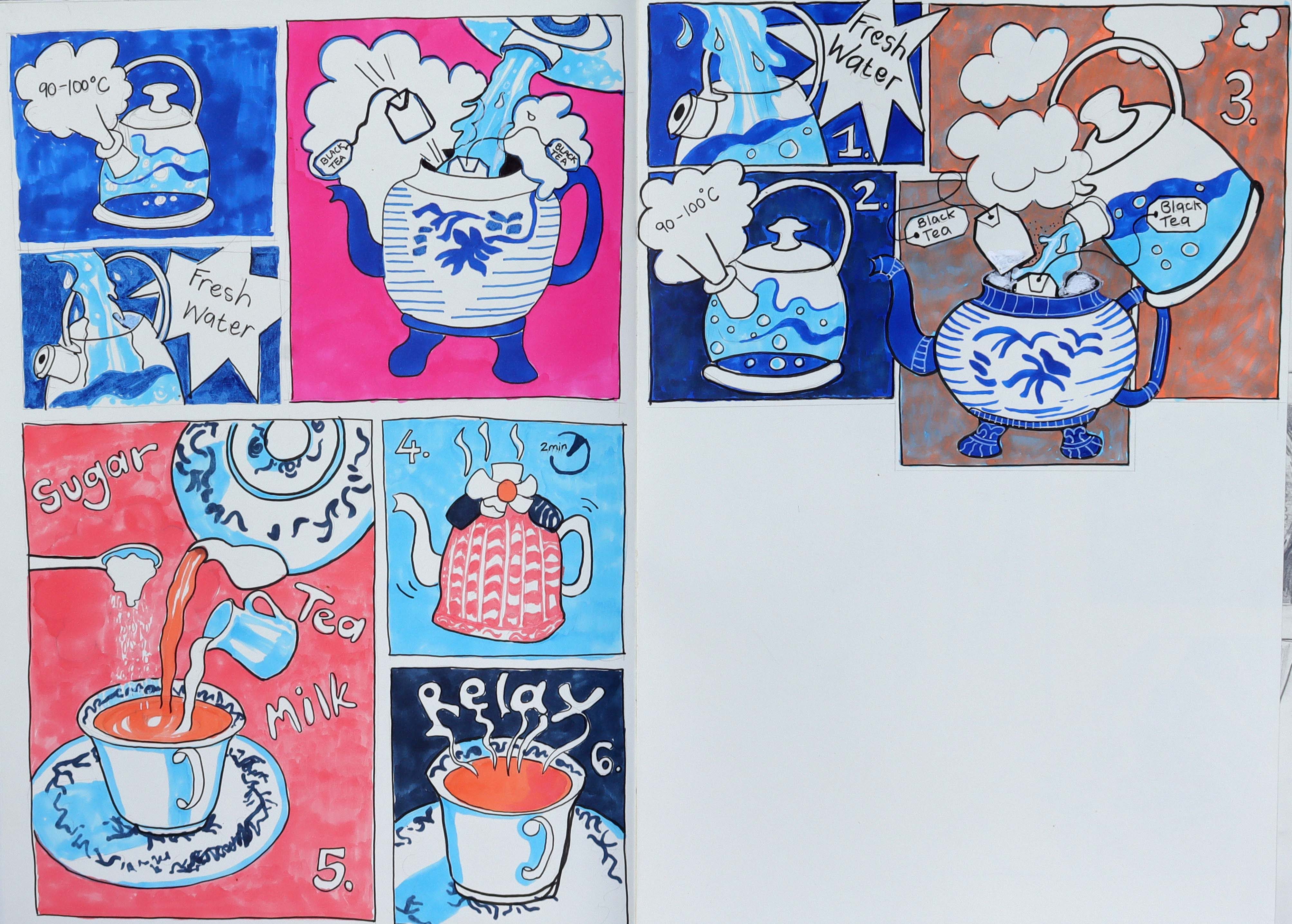
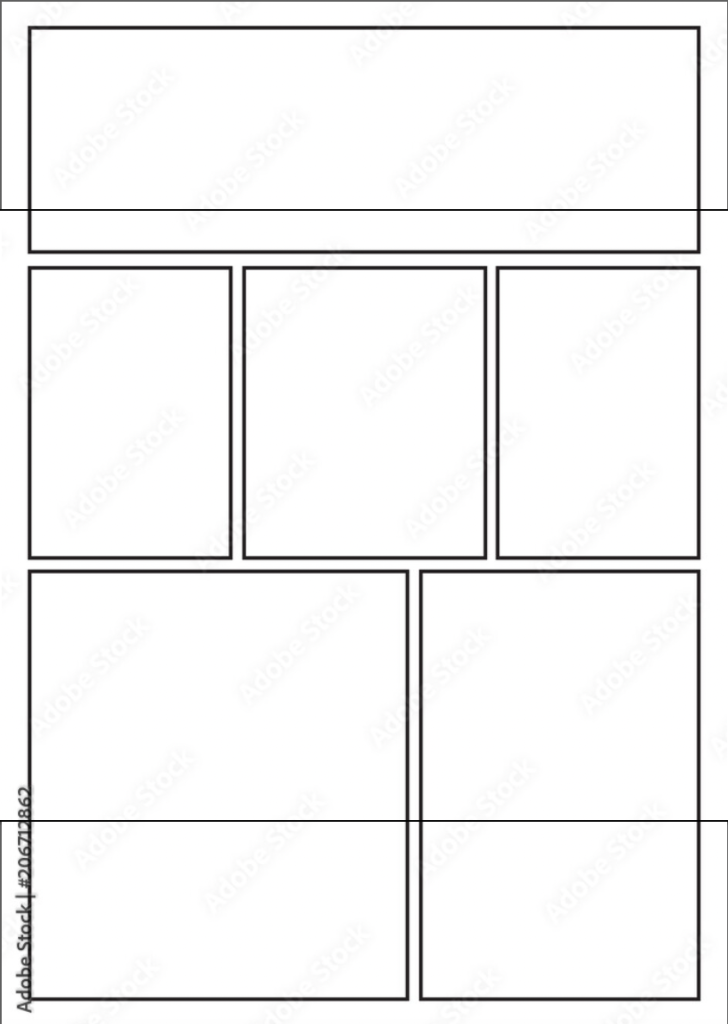
The colours of the thumbnails appeared too complicated for lino print, so I decided to do more thumbnails in Photoshop. I also looked at different layout templates and decided on a classic layout of reading left to right. I removed the numbers as it is unnecessary to show this number sequence using the classic layout. I have decided on light blue (for the water), orange (for the tea), and white and blue for the porcelain. I am limited to only a few colours when lino printing but also because I need to keep it simple to not detract from the main message.
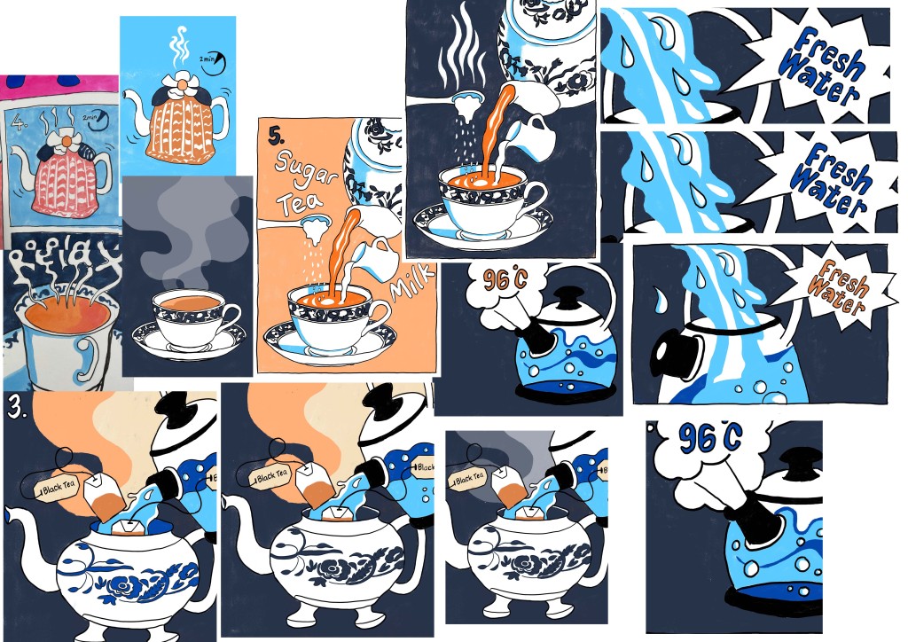
Once I had the designs all figured out, I made an outline drawing for the linocut process and also a colour example as a reference while cutting the lino.
In hindsight, I should have carved the illustration in one piece, printed it in black and added the colour with watercolour or alcohol marker afterwards. That is definitely what I will do next time, but instead, I have carved the frames separately together with the secondary blocks for the colours, and registration became a nightmare. Halfway through the process, I realised that this was not going to work and had to improvise by making another plan. The lino block that I used was easy to carve, but the downside was that it would crumble easily, which made detail work challenging to carve.
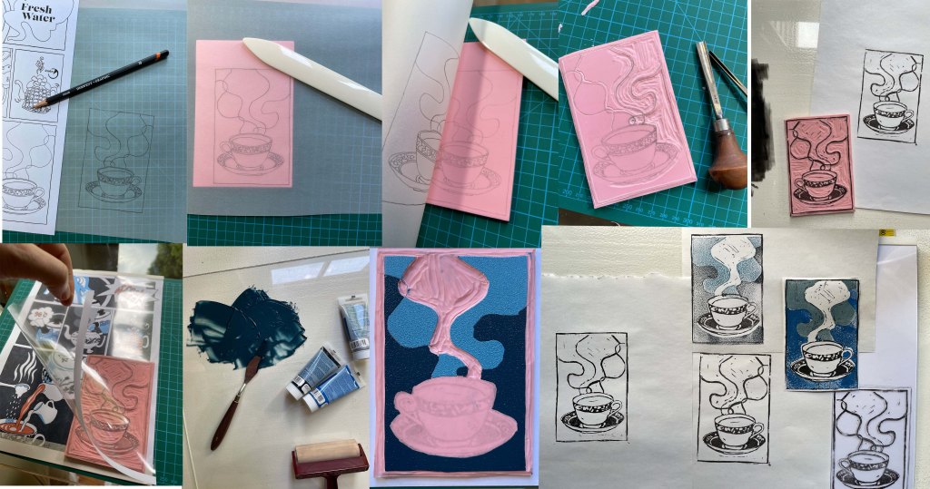

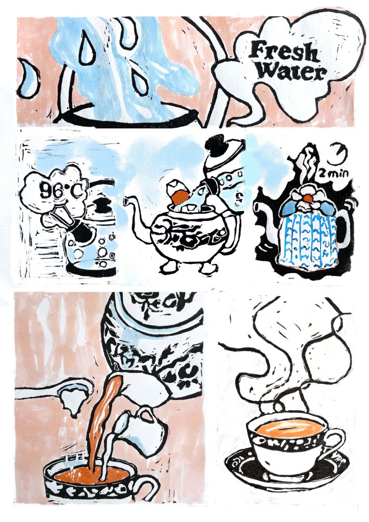
For the finished illustration, I have printed the lino print in black on separate pieces of paper, added the colour with alcohol markers and constructed the layout in Photoshop.
The main points in the illustration are using fresh water and making tea—the two peach coloured areas. The process in between are smaller blocks and darker in tone, so it falls more to the back and draws less attention. The final block, the completed cup-of-tea, stands alone from the process; that is why I made it slightly bigger and white with a touch of colour to draw the viewer’s attention to the tea.
In conclusion, I now know what I will do differently when doing lino printing. I will simplify it even more when doing a project like ‘Giving instructions’.
References
Sheeran, B., 2021. Jamie Oliver. [Online]
Available at: https://www.jamieoliver.com/features/how-to-make-the-perfect-cup-of-tea/
[Accessed 17 November 2021].
