In this exercise, I will cut out articles in a newspaper containing an illustration and study how the illustration relates to the text and the piece’s meaning. I will analyse the type of illustration. Is it decorative, conceptual, or informational? Does it use metaphor to convey an idea, or does it have a narrative base? Is it representational, abstract or diagrammatic? Next, I will imagine the paper has commissioned me to create an illustration. My task is to visually interpret the heading “Loves me, loves me not”. I will write a few sentences to create text that suits the title and create an illustration.
Analysing illustrations from newspaper cuttings (Figure 1)
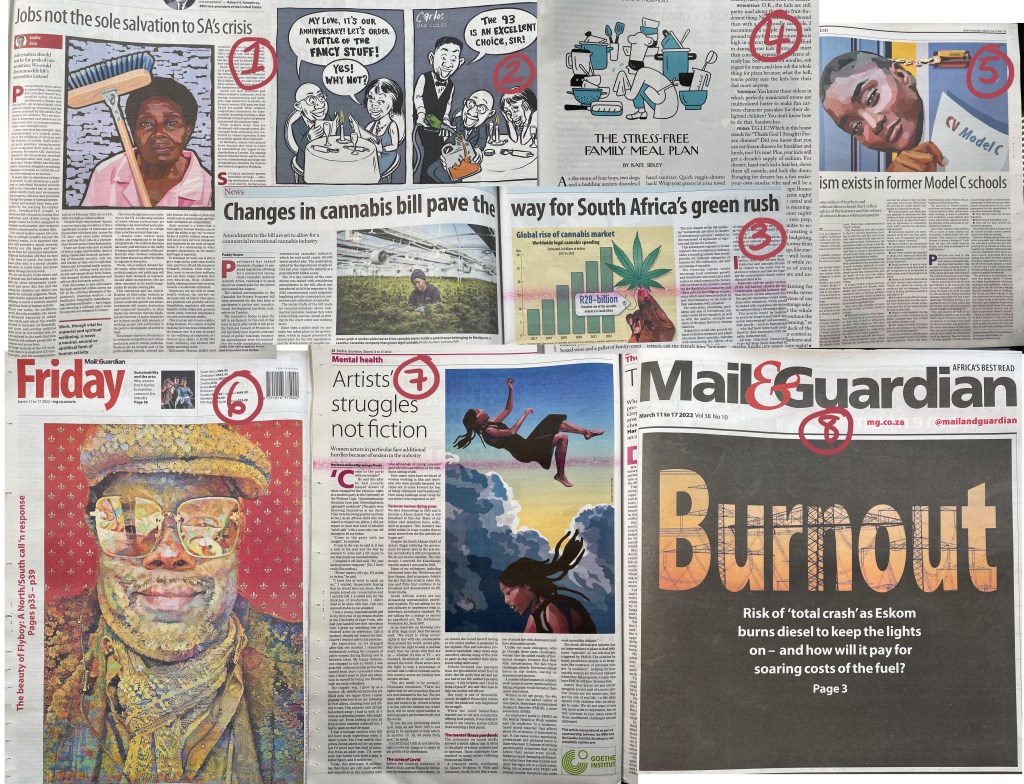
- The illustration is placed in the top centre of the page with the heading “Jobs not the sole salvation to SA’s crises”. This is an informational article about the unemployment crisis, and the illustration represents a working-class woman in South Africa.
- The comic strip is narrative-based and uses metaphor to represent the increasing fuel prices by comparing fuel to expensive wine.
- “Changes in cannabis bill pave the way for South Africa’s green rush” is also an informational article. The illustrator uses a diagram to convey a synopsis and draw the viewer to read more.
- “Stress-free family meal plan” is informational but also narrative base. The illustration tells a story of a mother overwhelmed by cooking for her family, and the article shares solutions to the problem. This is another way to rope in the reader by creating curiosity. The image tells a story about the problem, and the reader wants to read the answers in the article.
- “Racism exists in former Model C schools” is a political article, and the illustration is representational.
- The back page of the Mail and Guardian (March 11 to 17, 2022) is a beautiful decorative illustration of Greg Tate by Nettrice Gaskins. Greg Tate was an American writer, musician, and producer. “A long-time critic for The Village Voice, Tate focused particularly on African-American music and culture, helping to establish hip-hop as a genre worthy of music criticism.” (Philip Cross, 2022). Nettrice Gaskins is an African American digital artist. In her work, she explores “techno-vernacular creativity and Afrofuturism. (Wikipedia, 2021) The page reference next to the artwork directs the reader to a collection of publications inside the newspaper.
- “Artist struggles not fiction” is an article in the Mental Health section of the newspaper. The illustration is a representative illustration of women actors facing sexism in the industry.
- “Burnout” is an illustration on the front page. The illustrator combines text with graphic elements to convey a representational image of the energy crisis in South Africa.
Creating an editorial illustration
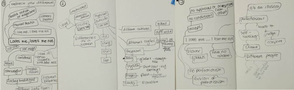
Brainstorming the phrase “Loves me, loves me not” generated ideas and a few key sentences for this editorial exercise.
The Editorial
Love me, loves me not.
Do you love yourself, or not? Can we learn to accept who we are without needing approval from others? Do you remember playing the game “She loves me, she loves me not” to determine if your new crush returns your affection? This memorable game symbolises the love we have or do not have for ourselves. Shatter the illusion of perfectionism and welcome a learning experience unique to who you are. Loving yourself unconditionally without the need to compare may bring out the best in yourself.
Collecting a visual diary and moodboard
I specifically collected images of women with unique features. I was playing with the idea of creating a grid of six windows. Each window tells a different story that is unique to the women in that panel. Initially, I wanted each woman to sit in the same pose. Keeping the same posture might emphasise their differences even more, which relates to the article suggesting not comparing yourself to other people and embracing your differences and imperfections.

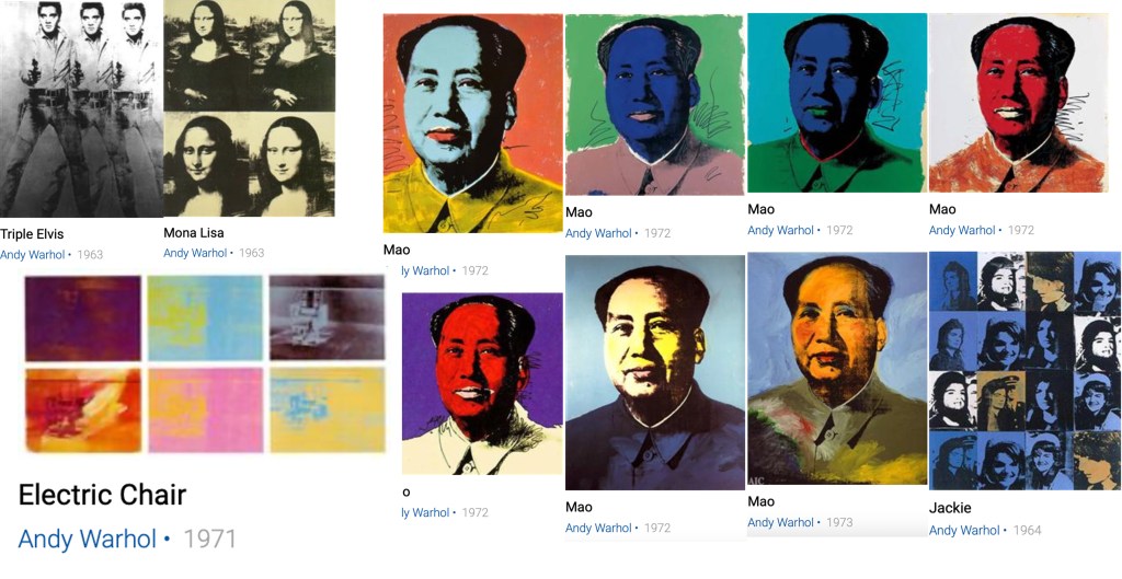
This image in my imagination sparked the idea to look at Andy Warhol’s work. Andy Warhol’s Nine Jackies(1964) came to mind, as well as Mona Lisa (1963), Mao (1972) and Triple Elvis (1963). I also liked Andy Warhol’s colours in Electric Chair (1971).
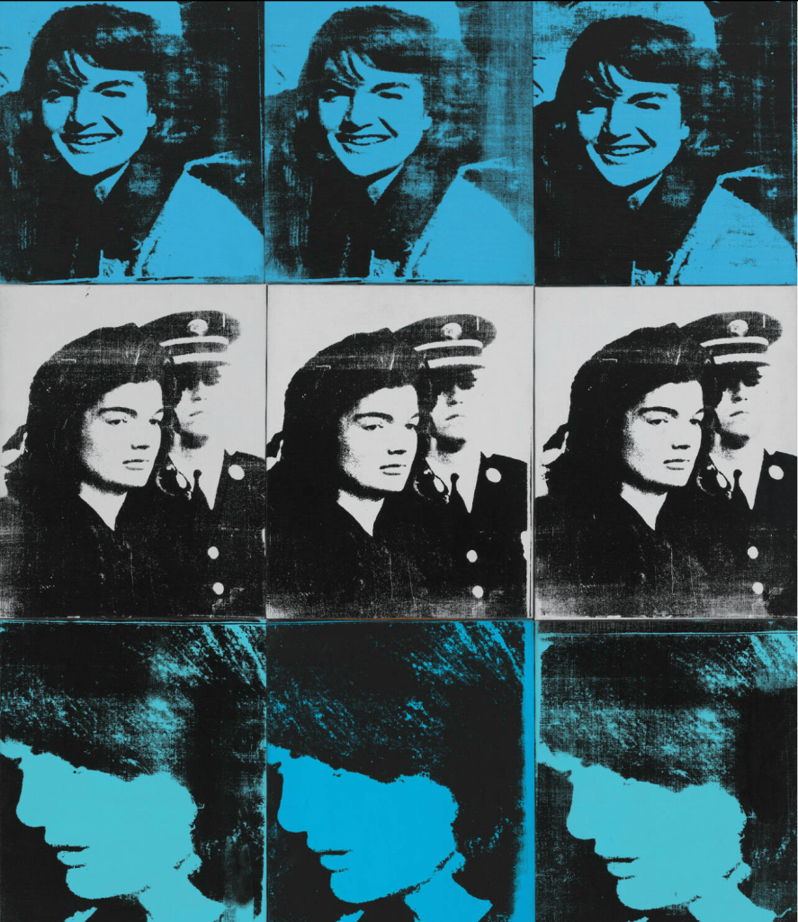
“In 1964, Andy Warhol appropriated newspaper photographs of Jacqueline Kennedy for a series of dramatic paintings in which he depicted the moments before and after the assassination of her husband, President John F. Kennedy. The top row of Nine Jackies features a smiling Jackie, the President’s face barely visible to her left. The image stands in juxtaposition to the shot that appears in the painting’s middle row, taken during the ceremony in which Kennedy’s flag-draped coffin was carried to the Capitol, and to the bottom row picture, snapped as a grief-stricken Jackie stood by Lyndon B.” (Whitney Museum , 2022)
Andy Warhol photo-mechanically transferred the newspaper photographs of Jackie onto silkscreens and printed them onto canvas. I want to use watercolour paint and ink to achieve the same look and feel in this exercise.
Thumbnail sketches and drawing ideas
When I was drawing up my thumbnails, I initially planned to use women only in this illustration, but I changed my mind once I had it down on paper.
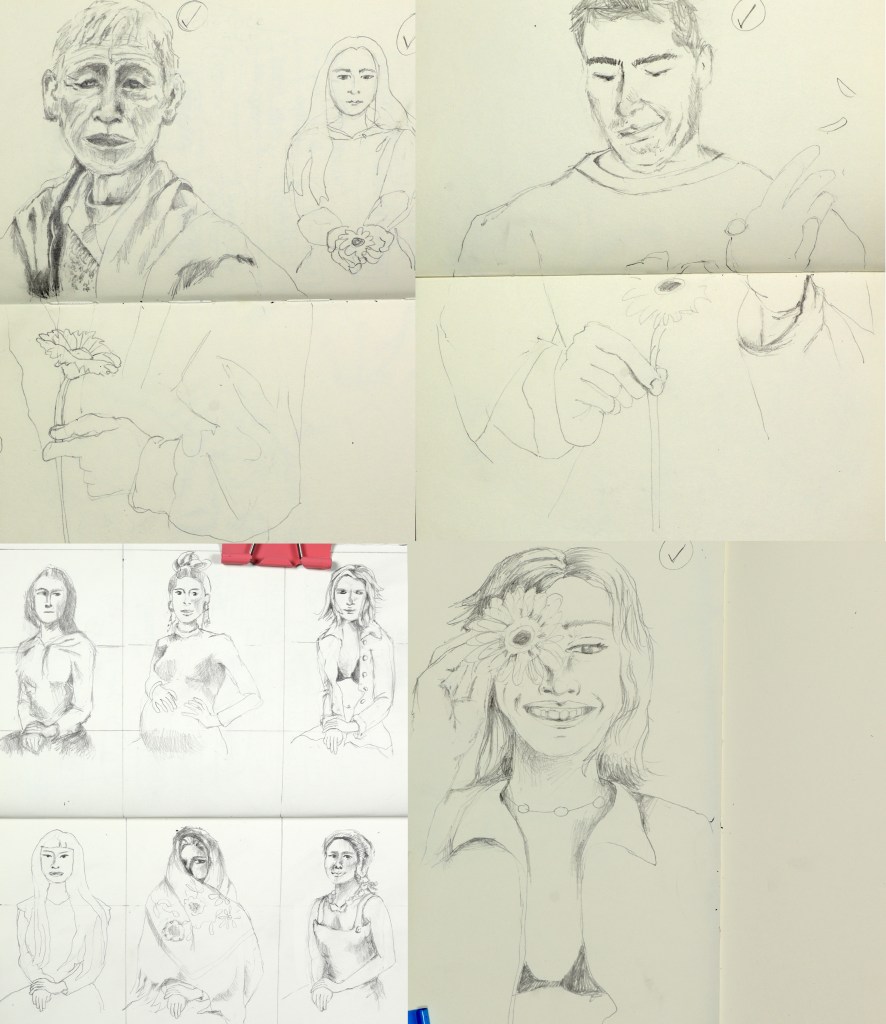
Once I had the six women down on paper, all sitting in the same position (bottom left, figure 6), I felt it needed more interaction with the game “loves me, loves me not”. It would be nice to include an older person, a younger person, and male figures to better represent society.
Creating the finished piece
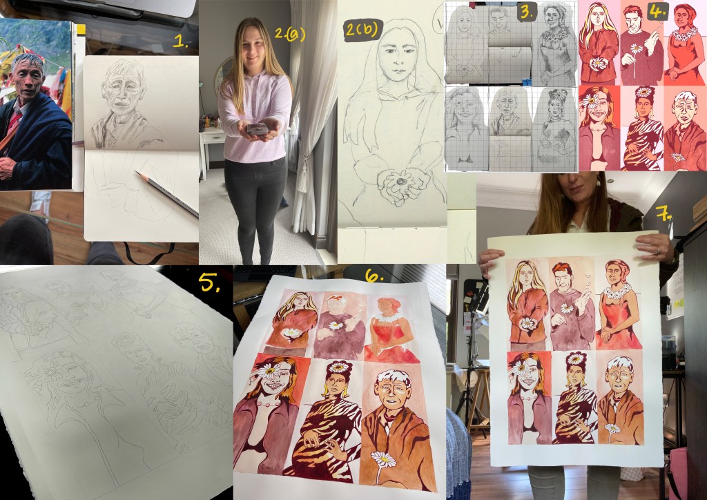
- Drawing from references using the National Geographic magazine.
- Drawing from real life. My daughter posed for me.
- I have scanned and pasted the thumbnail sketches digitally, using a grid to size the images proportionate to each other according to the grid.
- Using my pencil sketches as a foundation, I digitally worked out the colours and line weights.
- Once the design planning was completed, I transferred the drawing to A2 hot pressed watercolour paper using my Wacom tablet as a lightbox.
- I completed the illustration by using layers of watercolour, working primarily wet on wet. I then used Tombow’s water-base ink brush pen in Wine Red (837) for the outlines and line weight.
- For this exercise, I deliberately wanted to experiment with finding my scale when creating an illustration. I prefer to work at a larger scale and will remember this for future illustrations. It feels as if my hand can flow more naturally when I am drawing at a larger scale, and I prefer using bigger mop brushes and lots of water when doing watercolour painting. I think this is something I would like to explore further.


Works Cited
Philip Cross, 2022. Wikipedia. [Online]
Available at: https://en.wikipedia.org/wiki/Greg_Tate
[Accessed 4 April 2022].
Wikipedia, 2021. Wikipedia. [Online]
Available at: https://en.wikipedia.org/wiki/Nettrice_Gaskins
[Accessed 4 April 2022].
Whitney Museum , 2022. Whitney Museum of American Art. [Online]
Available at: https://whitney.org/collection/works/16292
[Accessed 5 April 2022].
