The Brief
This exercise is about how you deal with two different spaces to work in. You will design an A3 poster and an accompanying double-sided A6 flyer to promote a singing course run by an organisation called SingOut (all one word).
They want to print these posters on their photocopier. The client provided the information they want you to communicate with the audience. You first need to work out if you have all the information you need to fulfil the brief. If not, what is missing? Work out the hierarchy of the information. How will you divide your information to fit on both sides of your flyer? How will you link the design for the poster with that of the flyer? How can you make the poster eye-catching and effective with such a limited palette? Which typeface of faces will you use, and why have you made that decision?
When you have finished, pin your poster up and critique your work.
Spider diagram
As always, I first draw up a spider diagram to organise my thoughts around the brief and see if I have all the information. In this case, I do have all the information I need but it might be helpful to flesh it out.

For instance, it says in the brief, ‘Learn to sing different types of music’. I can give the audience an example of the types of music they can expect and also an image to capture their imagination. I brainstormed different kinds of music and the most popular genres can be narrowed down to Pop, Rock and EDM (Electronic Dance Music). This is important to know to attract attention by using relevant visual images.
Although music is one of the sub-categories, the main keyword is sing. The poster and flyer are all about singing and voice training; the less important keywords are music, socialising and fun.
Using the information given to me, I can assume that the audience’s age group will not be school children as the starting time of the classes is during school hours. Of course, in real life, I will make sure of these facts by collecting the relevant information, but for this exercise, I will say that the age group is between 18 and 100. This includes all walks of life and whoever is available at that time. As voice coaching should be a consistent practice, I will make another assumption that this is a permanent time slot and not just a holiday club.
Now I will brainstorm further by sketching.
Sketches
While sketching I am collecting visual references as I need them. I used the spider diagram to stay on track with the tone and feel I wanted to create.

The expression of the person singing needs to come across clearly, and I wanted to capture it in the drawing as the focus words for this project are ‘voice coaching and singing’. Once I had the drawing the way I wanted, I was curious to see what would happen when I did an image trace in Illustrator and converted my drawings to vector. I have done the setting on high noise and path to try and capture the ‘grunge’ feel of the pencil and played around with the image trace settings before expanding the image.

I think sketches B and C capture the singing expression the best. The image tracing has given me some good results, and I will now explore other imaging options and start working on layouts and composition. I collected more visual references. The A6 flyers will be photocopied, so a zine or comic feel in black and white could work well.
I specifically looked at the expression of the character in Calvin and Hobbes by cartoonist Bill Watterson. Watterson’s character expressions are spot-on and intense, which I feel is the success of his comic books.

Edward Bawden’s black and white sketches and maps are also a source of inspiration to see how he used contrast and linework. I noticed that he used cross-hatching to create a grey tone and I will try this technique in my sketches as well, but instead of cross-hatching I will be using halftone, dots and patterned brushes in Procreate.

This technique is ideal for creating a grey mid-tone, but the copier would be able to copy the complete greyscale. I tested my copier at home just to make sure. There is no need to use this technique as you will do when creating an etch or a monoprint. I will use some halftone rendering techniques to develop this project further.
Divide the information and layouts
I first started with the poster and once I have an idea of what the poster will look like, the A6 flyer will follow the same style.

I have not decided yet if I want to use coloured paper, but while doing these layouts, I have experimented with the idea of coloured paper by using a coloured background in my software. I do think that a white background can be more eye-catching because you have a more extensive range of contrast. You will forgo the very light tones if you want to use coloured paper and I have to decide if this will suit the style of this project.
The first layout (Layout A) feels as if the centre of the poster is too compact as if the elements are too ‘squeezed in’ and need more white space. The second layout (Layout B) has potential but I don’t like the text at a diagonal angle so I rotated the composition in Layout C. I think Layout C works the best so far.
Layout D is more inclusive and shows that men and women are welcome but once again, it needs more whitespace to allow the composition to breathe.

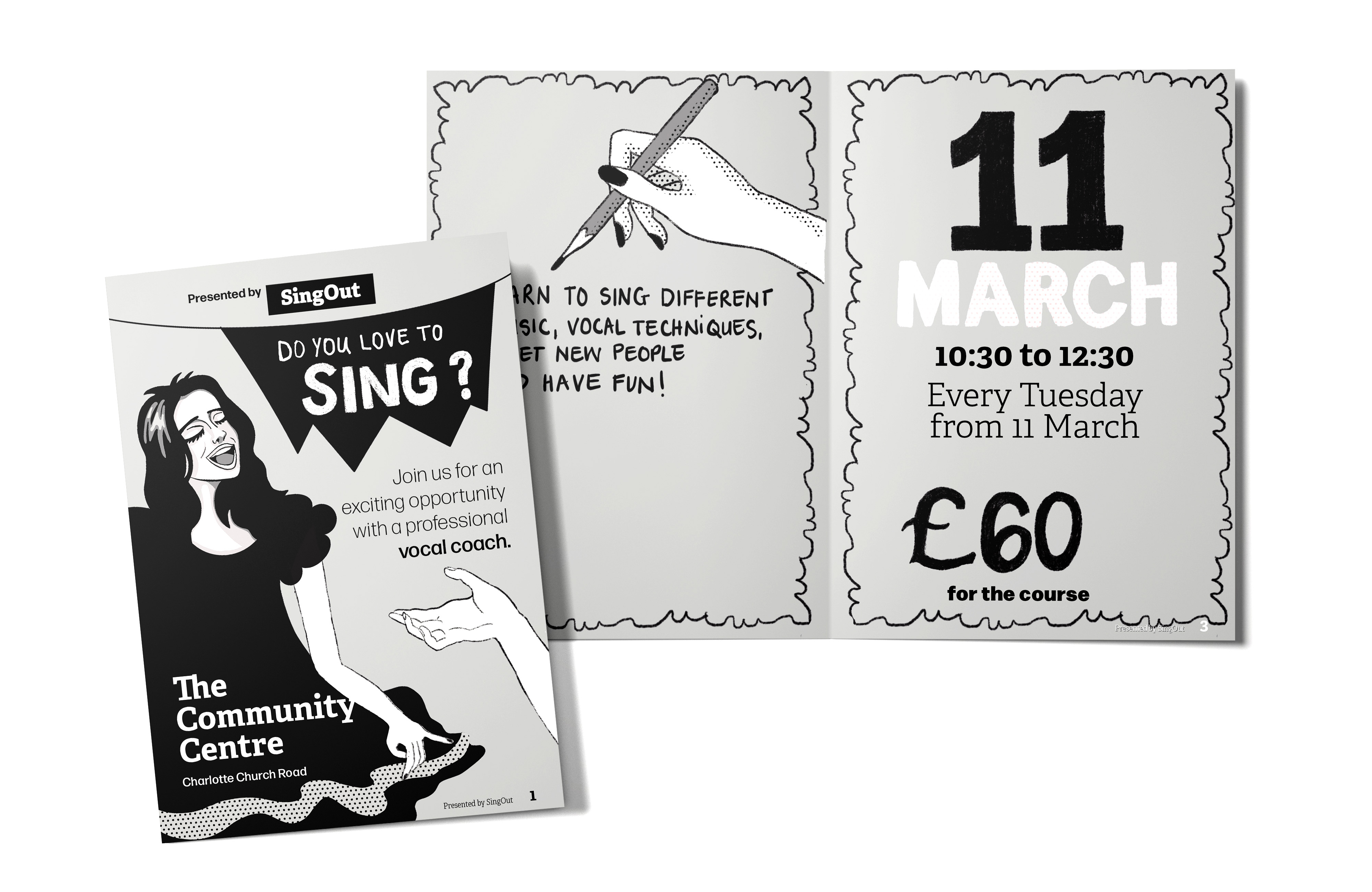
Spread 1 (figure 7) has a zine/comic feel. The ’11 March’ on the girl’s dress could be placed somewhere else to show off the shape of the circle, e.g. against a contrasting background. The rest of the composition needs more white space, but the rest of the pages of this spread works well and I especially like the border I created to give the pages more contrast and punch.
Spread 2 (figure 7) has both the man and the woman on the front cover, but I think the halftone in the background is too light. A bolder halftone will work better, or even replacing the halftone with a flat grey mid-tone could work well. I think I have taken the flags a little too far on this layout and for this reason, I won’t use this layout.

In figure 8, I have added white to the illustration and forgoing the possibility of printing on coloured paper. I have also decided to refine the illustration style to look more crisp, considering that it will be printed on a small scale. I then experimented with the border in white for the front and back page, but once I made a prototype (figure 9, B), I realised it looked better with the border on the inside pages only, as can be seen in figure 9, A. The white line between the two pages on the inside also looks much nicer and gives the inside pages more definition.
Final draft
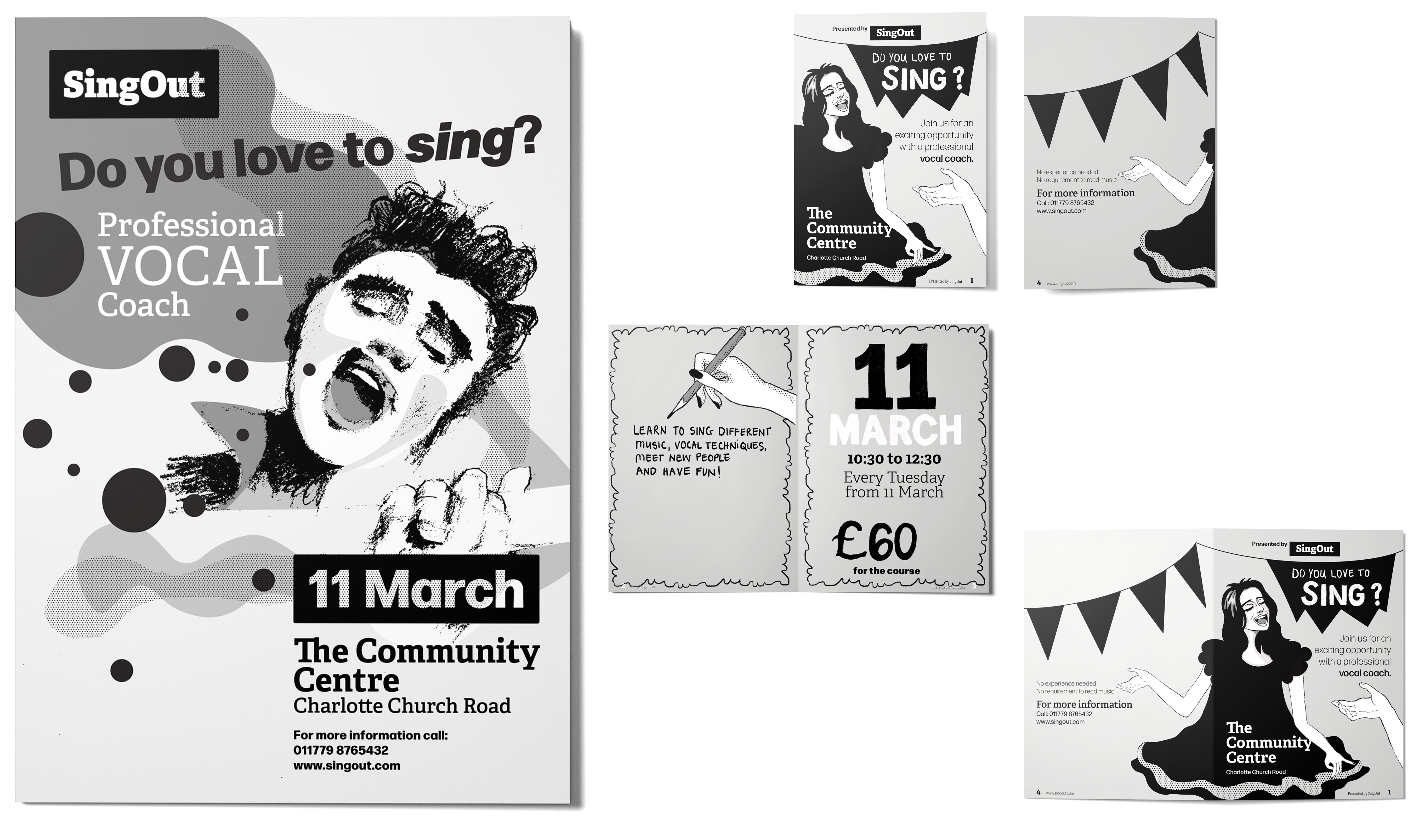
The way I am going to link the design of the poster and the flyer will be by using the same style, typography and the same heading; ‘Do you like to sing?’. I will use a man on the poster and a woman on the flyer and keep the tone of both consistent. The poster and flyer’s spacing will be kept at the same ratio. I am going for cleaner line work with fewer textures to achieve a clear visual at a small scale. I will work in Adobe Illustrator for this project and select the type by typing out the fonts that might be a possibility and choosing the best from my list.

Typeface
At first I considered a script typeface for the ‘Do you love to sing?’ but once I explored the typefaces, I decided that a bold low contrast sans-serif would be more effective and work best for the heading.
Forma DJR Display is my choice. It is bold and structured but not too formal. The letters have a friendly and inviting feel. The counters/bowls are wide and round and attract attention to the heading. I’ve compared the ‘Deck’ with the ‘Display’ version, and the ‘Deck’ will work the best for this poster. I may adjust the weight when working with the A6 flyer, but because it is a superfamily, the options are plenty.

I narrowed the type pairing down by creating a test sheet (figure 11) and decided on the Forma DJR and Adelle combination. Adelle is a slab-serif and comes in a ‘heavy’ weight, ideal for the ‘Singout’ wordmark.

Creating the Poster
I wanted to capture the movement of music in this poster by using different contrasting textures, such as the roughness of the charcoal, the smoothness of the round vector shapes and the grain of the halftone. Just like music, these shapes and textures contrast with each other and will be loud and then softer and almost whispering.
I was steering away from having all elements too structured and clinical. You want to feel the music when you look at the poster and entice the reader to take part in this event. I think I did succeed in this. Like you need darkness to see the light, I had to have a more structured type, such as Forma DJR Deck to create that contrast with Adelle. Forma DJR Deck also brought a solid structure to the poster, which I could not achieve with, for instance, a script font.
I am happy with the poster (figure 12) and will now move on to finishing the A6 flyer.

Creating the flyer
I decided to change the girl’s dress on the front page, and I don’t think that was such a good idea. The black dress gives the flyer more substance and contrast. I changed the dress because I wanted to go for a more mature look, as the audience will mainly be adults.

I have brought in more texture in the hair, but I prefer the glossy hair. The shiny hair gives the character a more ‘angelic with an angel voice’ feel. I liked the texture in the handwritten ‘Do you love to sing’ of the previous draft in figure 8A, and I think it will still all tie in with the main poster.
The new draft in figure 13 misses the hand lettering aspect, which can be seen as part of the illustration. I will bring that back and use a simple black border around the edge instead of the thick, scalloped border.
The layout looked less cramped once I used type; the spacing worked well in InDesign. I think I have achieved the comic/zine feel I was after and the poster and flyer work well together. The style is consistent for both of them from the typography, the same digital brushes and 35% CMYK grey.
All the illustrations in this project are my own work. I sometimes sketch random sketches in my sketchbook over time and use them in a project at a later stage. If it inspired me enough to draw it in the first place, it would be useful at some time or another. A good example is the hand study I did in my sketchbook (figure 2), which is now used in my A6 Flyer.
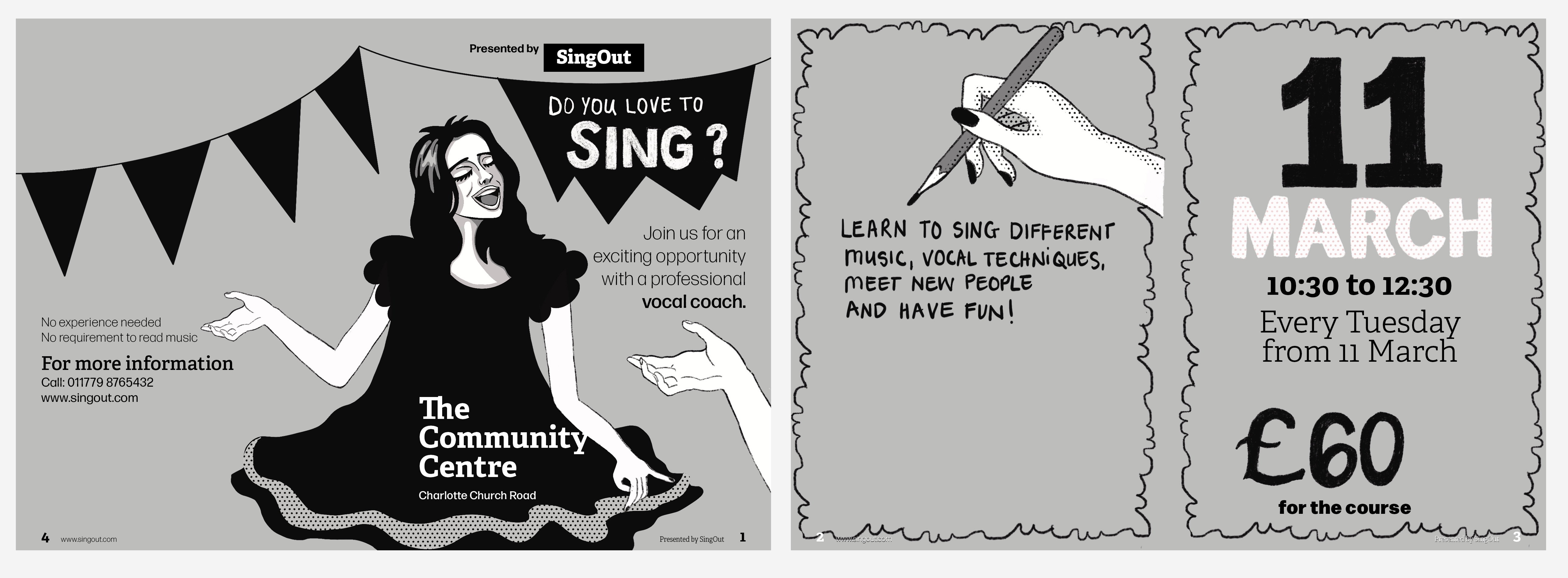
I am much happier with the outcome now that I have made the changes in figure 14. Even though the other dress looks more mature, the dress in figure 14 has more movement and interest. The hand lettering ties in nicely with the illustrations and bring life to the design. I like using my free hand when doing hand lettering to get that tactile feel and mood.
Overall this was much more challenging than what I expected. Making a design eye-catching with a limited colour palette required me to be more aware of all the other elements available to use in my design. I am eventually happy with the design after making all the changes I thought did not work. Going forward, I will think about the page numbers and how they will display before placing
